Streamlining an app 2,500+ staff rely on every day
Zolo’s Property Management App runs the day across co-living and student housing. Years of added features had left it scattered, so I redesigned it end to end — to make the tasks staff do most easy to find, quick to finish, and obvious the first time.
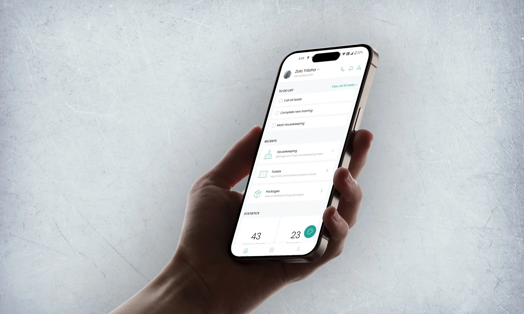
Overview
The app is Zolo’s internal tool for running two businesses: Zolo Stays, which is co-living, and Zolo Scholar, which is student housing. Housekeepers, wardens, property managers, cluster managers and city managers all work in it, each seeing a different slice.
It has over 10,000 downloads and around 2,500 staff in it on a given day. They use it to track work, log issues, book maintenance and manage residents — everything that keeps a property running.
Features had been added for years without anyone stepping back, and it showed. Work was spread across screens that didn’t connect. New staff — and in this job there are always new staff — took weeks to get comfortable.
I was the only designer on it and ran the whole thing, from the first interview to the final screens. The job was to make the tasks staff repeat every day take less work.
The Brief
Make the app quicker to work in. Shorten the flows, cut the friction, and put the important actions within reach — so staff can finish a task without stopping to work out how.
Research
I wanted to know not just where the app was slow, but why. So I looked at it twice: once as a product, on its own terms, and once over the shoulder of the people using it on a shift.
Two methods — one on the product, one on the people.
1.Product Audit (Heuristic + Workflow Analysis)
I walked the app’s main workflows end to end, screen by screen, and wrote down every place it slowed someone down or left them guessing.
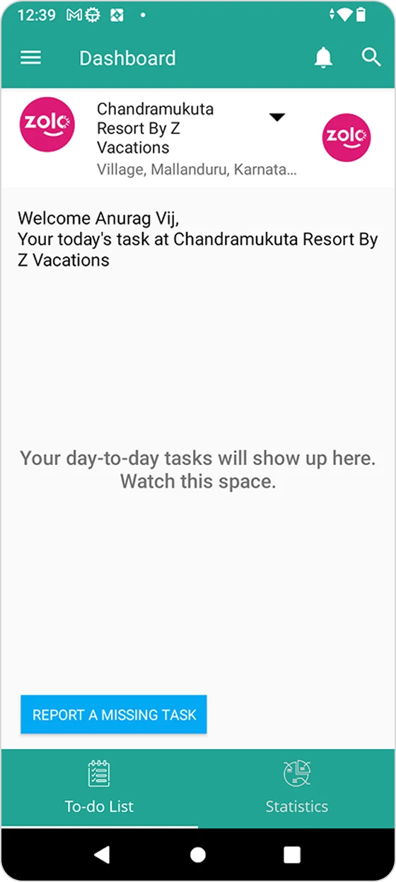
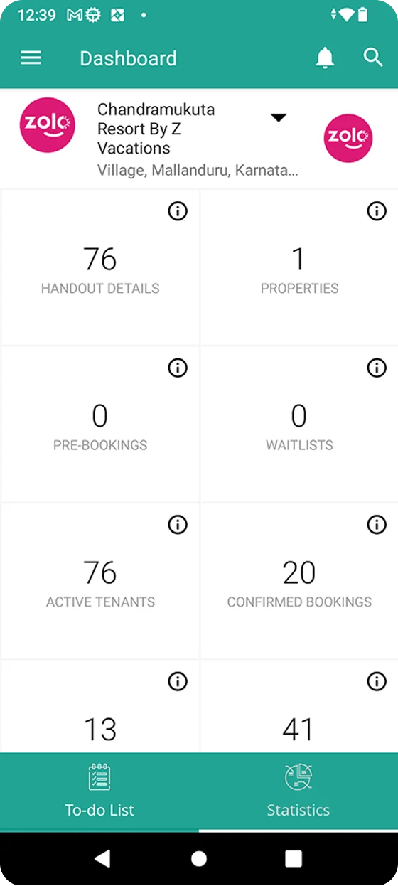
This is one page. It scrolls so far that it took three screenshots to capture.

Four things kept coming up, and they all point the same way: the app makes staff work to reach the work.
2.User Analysis (Informal Interviews + Behavioral Insights)
An audit tells you what’s wrong with a screen. It doesn’t tell you what someone was trying to do when they gave up. So I sat with staff and watched them work.
- Talked to staff informally about what slows them down
- Asked what their day actually involves, and what they expect the app to do
- Handed new staff the app and asked them to complete a specific task
- Watched where they hesitated, and how they got themselves unstuck
Watching people use it turned up things the audit never would — mostly about what they expect before they even open it.
Problem Definition
The app could do everything it needed to. The problem was the shape of it — the right features, arranged so that finding them, finishing them and learning them all cost more than they should.
Design Solution
Four problems, so four goals — one each. Everything I designed after this traces back to one of them.
Information Architecture
I didn’t draw a single screen until this was sorted. Redesigning screens on top of a broken structure just makes the same problem look better.
- Home Page
- To do List
- Property Selector
- Menu
- Profile
- Up to 59 Features
- Settings
- Contact Manager
- User Search
- Notifications
- Statistics
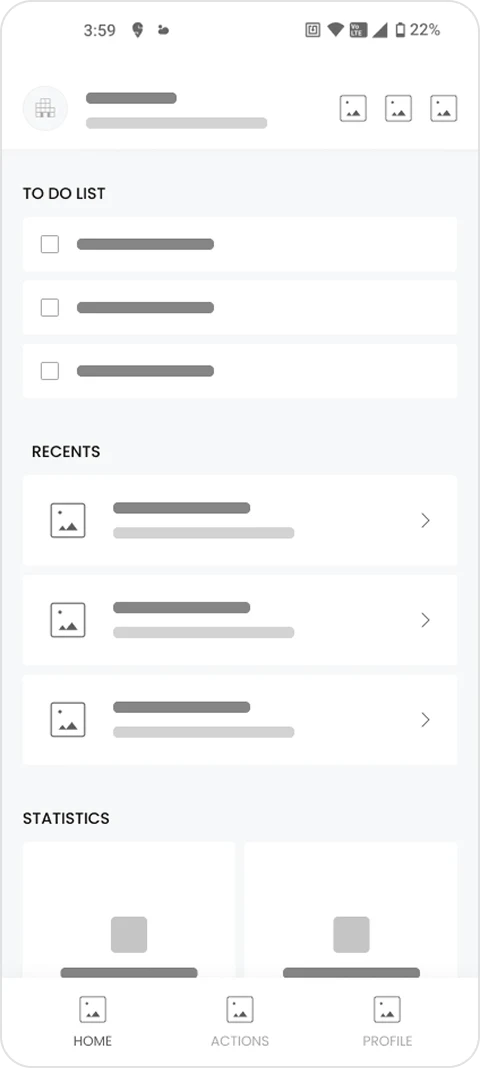
- Home Page
- To do List
- Recent Actions
- Statistics
- Property Selector
- Contact Manager
- Notifications
- User Search
- Actions
- Stay Actions
- Up to 6 Features
- Manage Actions
- Up to 13 Features
- Operations Actions
- Up to 9 Features
- Profile
- Personal Details
- Settings
- Logout
Feature Grouping
59 features, in one flat list, with duplicates. Here is all of it — this is what a staff member scrolled past to find the one thing they came in to do.
I cut the list down three ways:
- Merged features that did the same job into one entry point
- Split the rest by business, so Scholar staff never see Co-living tools
- Sorted what was left into three groups — Stay, Manage and Operations
Wireframing
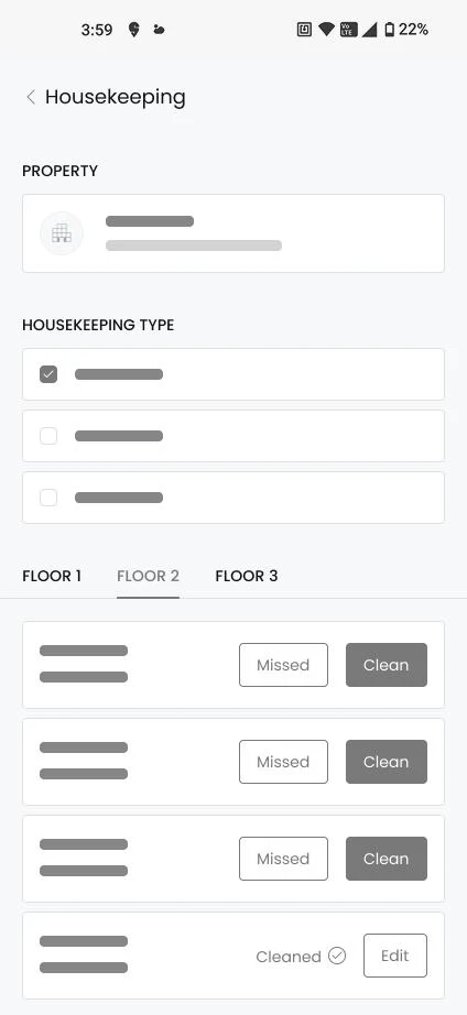
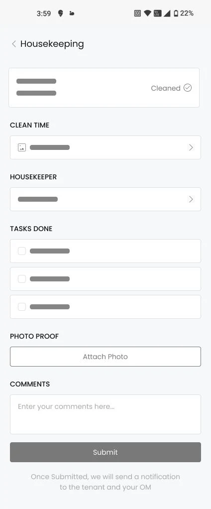
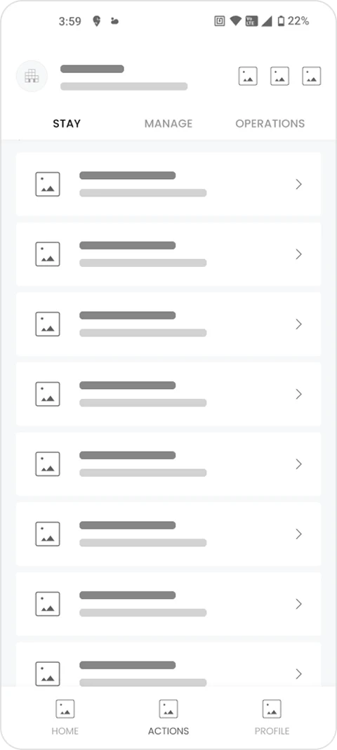
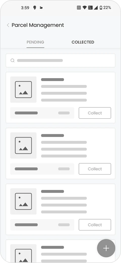
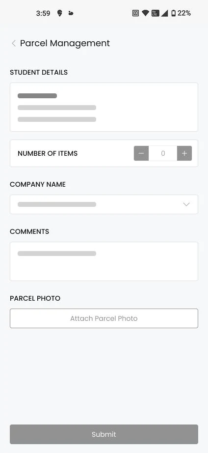
I sketched in grey boxes first, so I was arguing about steps and not about styling. Housekeeping and Parcel Management are here because they are the two flows I go on to rebuild in full.
Final Design
A new home screen that leads with the work, and the two heaviest flows rebuilt around it. Every change below answers something from the research.
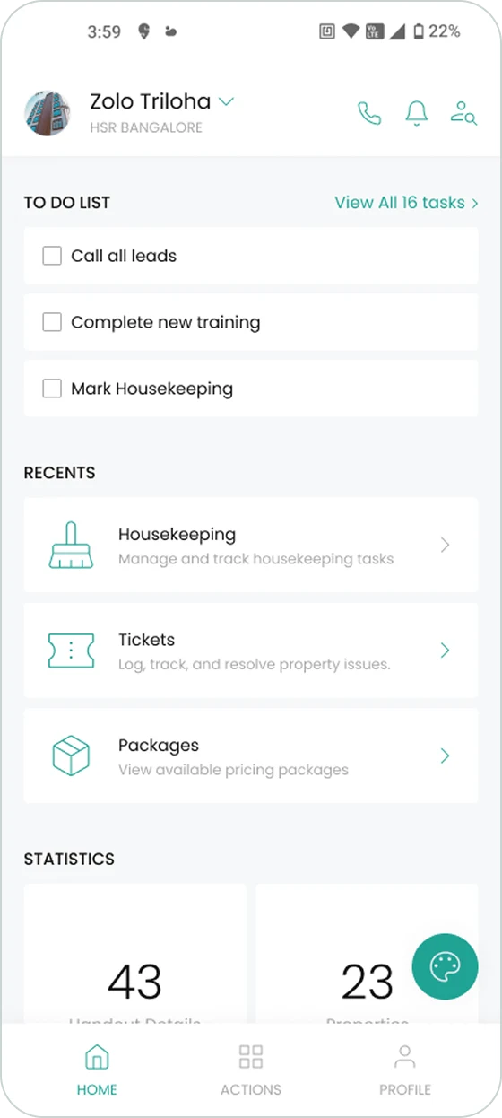
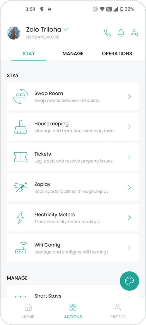
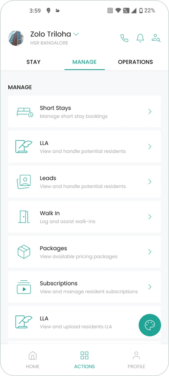
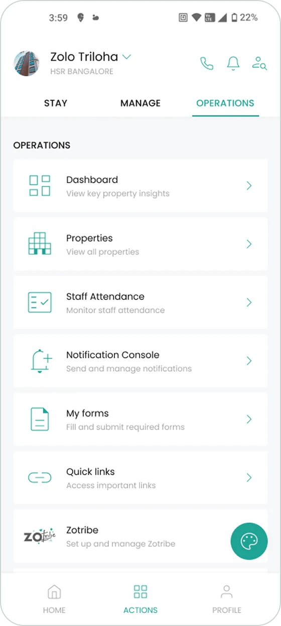
Every task now lives on one page, split into Stay, Manage and Operations. The strip along the top holds the most-used actions, so most of the time nobody has to scroll at all.
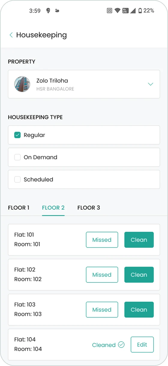
Housekeeping used to take five pages, one of which made you type the property name by hand. It now takes two. Not a clever fix — but it is the task staff log most often, every day.
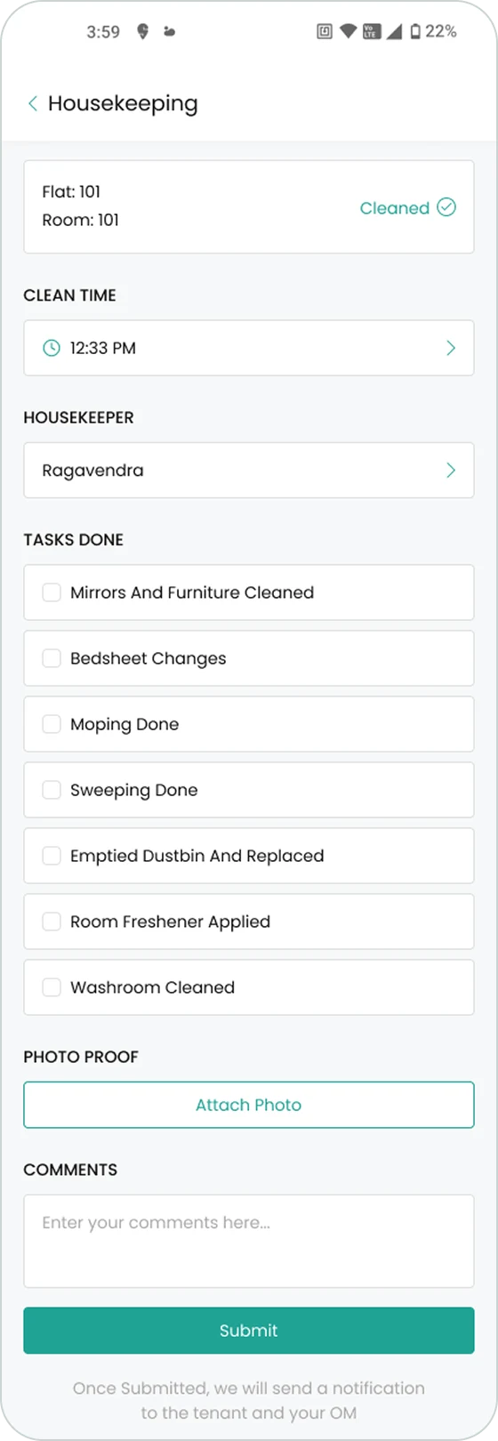
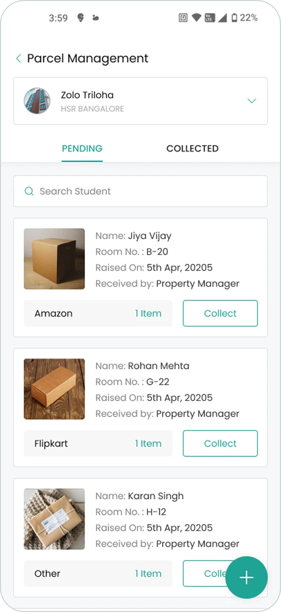
The steps here were already right, so I left them alone and cleaned up what was around them. Less on each screen, and the thing you need next is where you expect it.
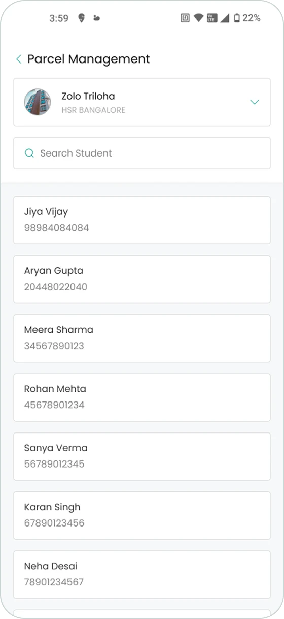
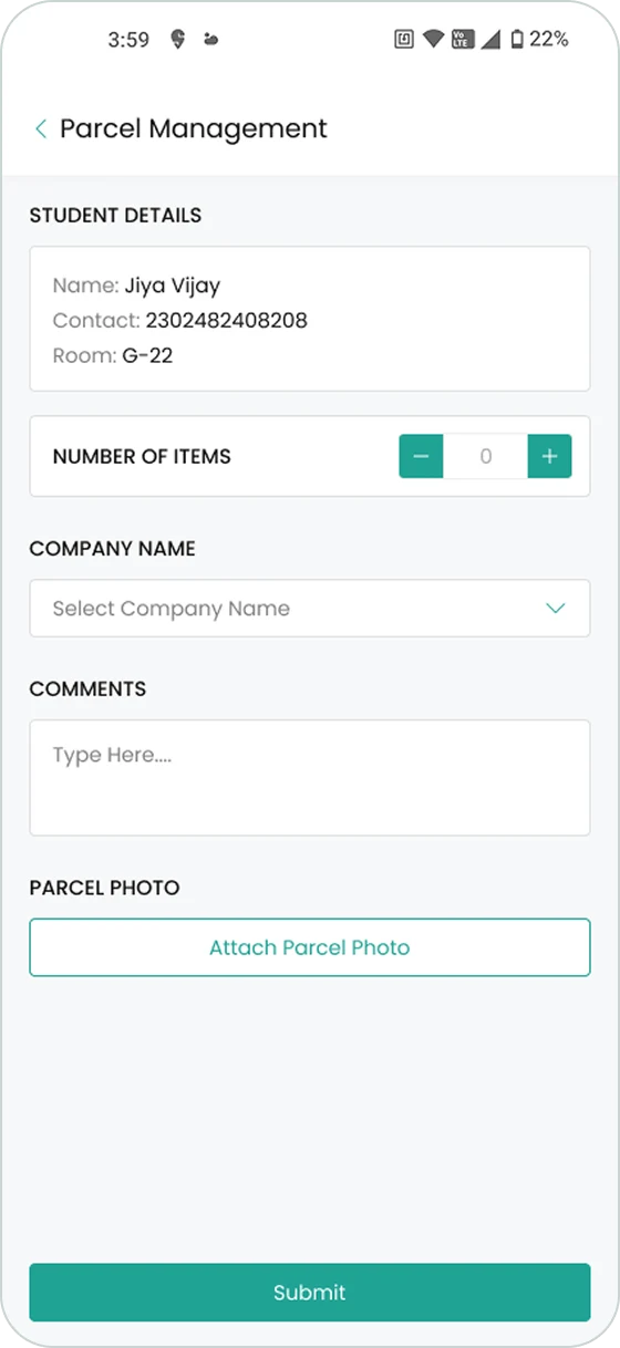
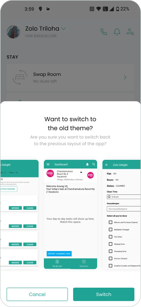
2,500 people run their working day in this app. Changing it overnight would have stalled that work while everyone relearned it — a cost the business pays, not the design. So the old UI stays live and anyone can switch back, and the move happens gradually, at each person’s own pace.
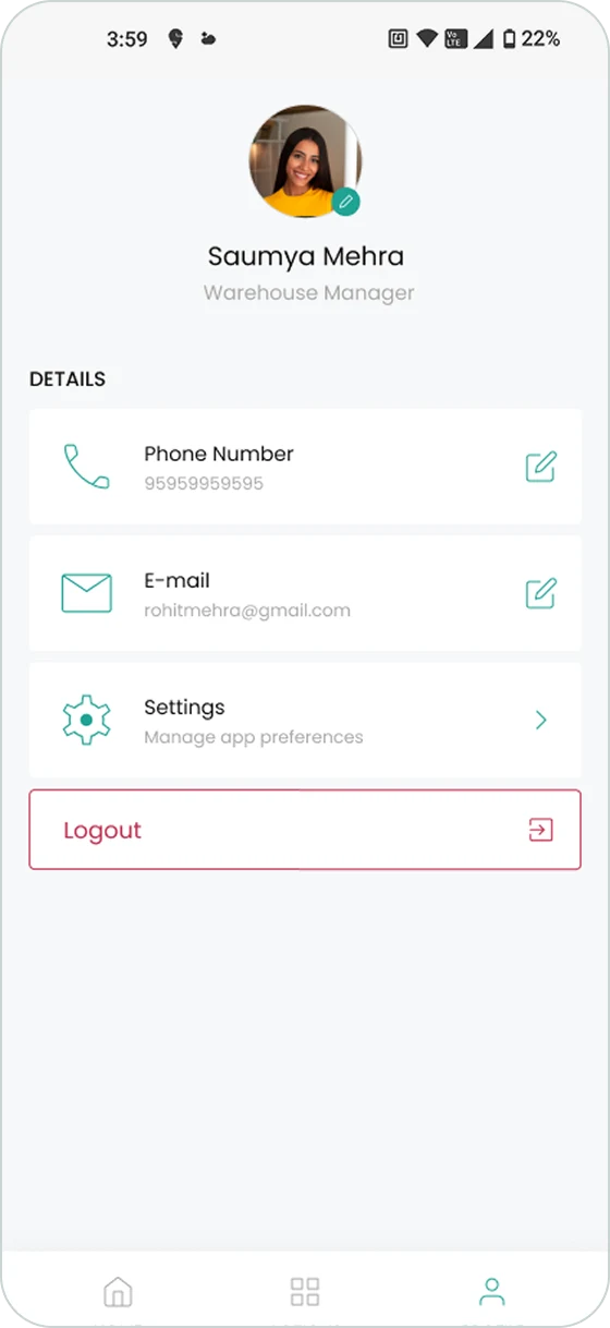
Everything about you — details, settings, logout — in one place instead of scattered through the menu.
Comparison
The same housekeeping task, run twice. On the left, the old flow: several screens, the property typed in by hand, and a lot of it before the actual work starts. On the right, the new one.
Outcomes
I put the new flow in front of staff and watched. They finished the housekeeping task considerably faster than on the old one — how much faster I can’t say, because we never instrumented it, but the gap is plain enough in the recording above.
The app went from something staff worked around to something they work with.