Zolostays
A Managed Co-Living Platform
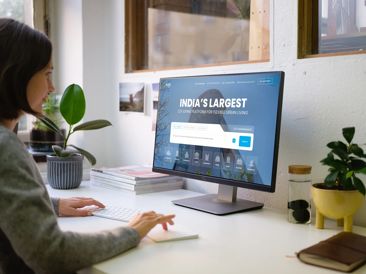
Overview
Zolostays is a co-living and rental platform with 400+ properties across India — furnished homes, flexible stays, and a community built for students and young professionals.
The website is the front door. It hadn’t been updated in years.
Role
Product Designer. Sole designer on the website, rebuilding it across two versions with product and engineering — the first working inside the content we had, the second with the content we’d argued for.
Scale
The Funnel
Nearly all traffic moves through four pages. Each one has exactly one job.
Before
The Starting Point
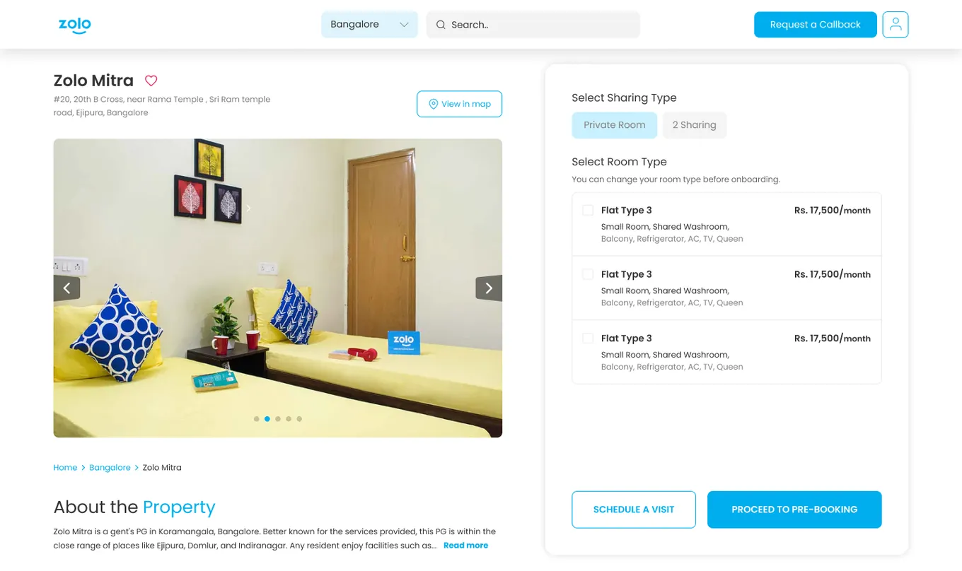
The site had been built up over years as the business grew, each new city and property type bolted onto a structure that hadn’t planned for them. Parts of it were visually inconsistent, some UI was outright broken, and the homepage still led with COVID-19 precautions.
But the real problem was narrower than “it looks old.” Almost all traffic moves through four pages, and each one has exactly one job:
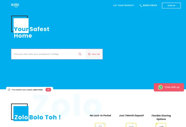 home
home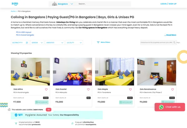 listing
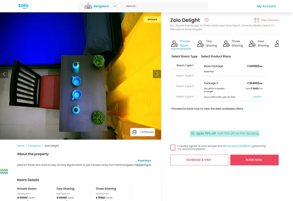 property
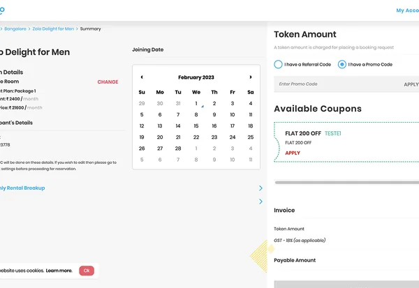 booking
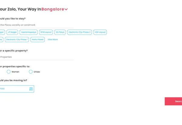 search
The five pages, before
None of the four were doing their job.
Version 1
Working Within the Content
Key Insights
- Most of what was broken needed better per-property content — and we had 400+ properties
- Sourcing that content was an operations project across teams I didn’t control
- Brand-level content, unlike property-level content, could be written once and appear everywhere
- Whatever we couldn’t fix now was worth documenting properly
The Problem
The fixes that mattered most needed data we didn’t have. Waiting for it meant shipping nothing for months on a site that was actively losing people.
The Solution
One rule: redesign everything, add nothing. Same content, same data model, better structure and presentation. Anything the rule blocked went on a list — and that list became the case for V2.
Brand
The old identity was dated and split across two primaries, Zolo red and Zolo blue, used inconsistently enough that neither read as ownable. We consolidated to blue alone, brought in a softer pastel palette, and added a trapezium as a recurring structural element to give the system character beyond colour.
Doing this first meant every page after it inherited a working system instead of inventing one.
Home
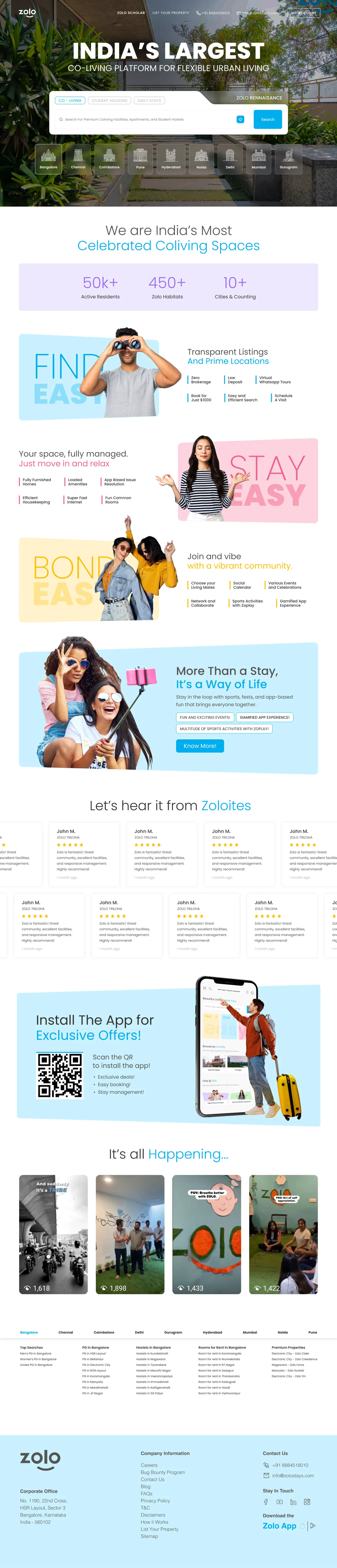
The homepage was still leading with COVID-19 messaging and never clearly said what Zolostays was. We rebuilt it around the company’s positioning rather than its logistics — what living here is like, who it’s for, why it isn’t a rental listing site.

Listing
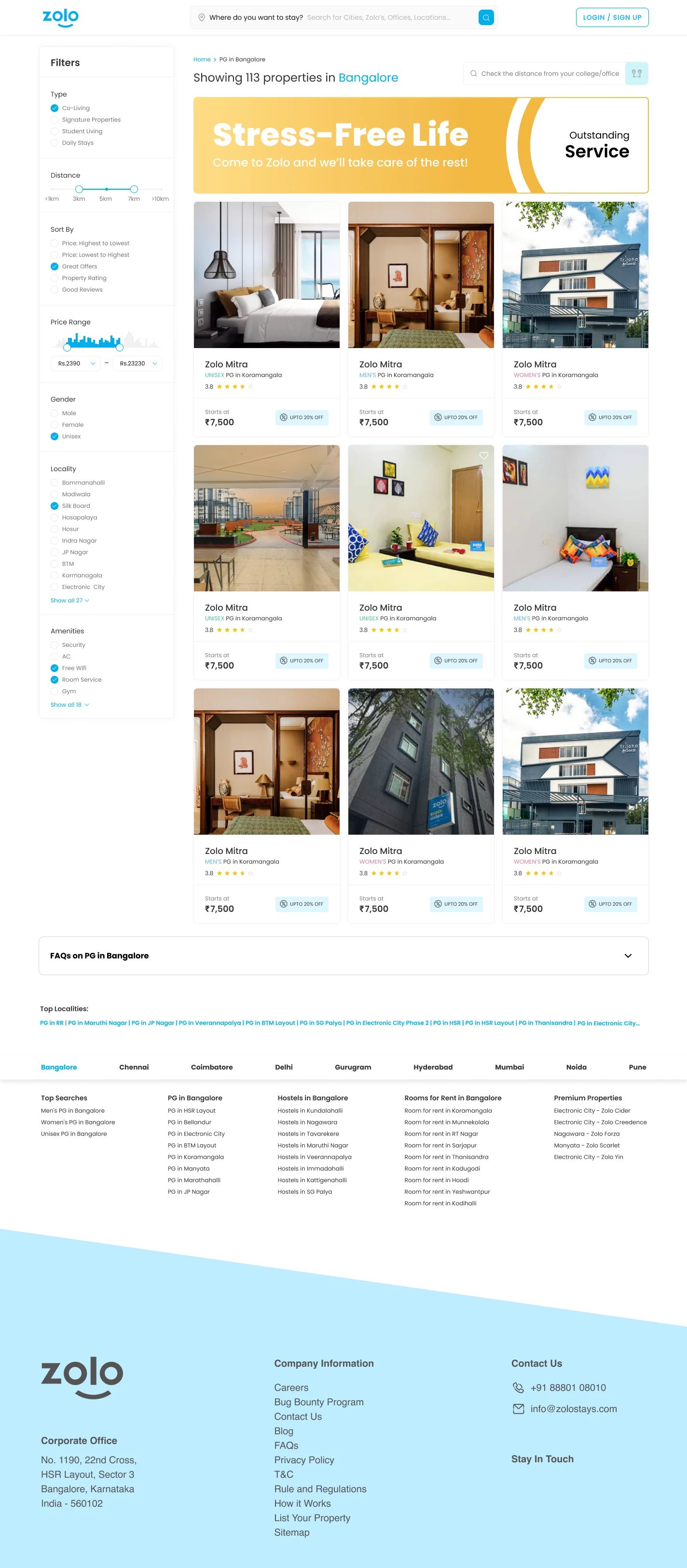
A large share of our traffic never touched the homepage. Someone searching “PG in Koramangala” lands on the Koramangala listing page directly — for that person, the PLP is the homepage.
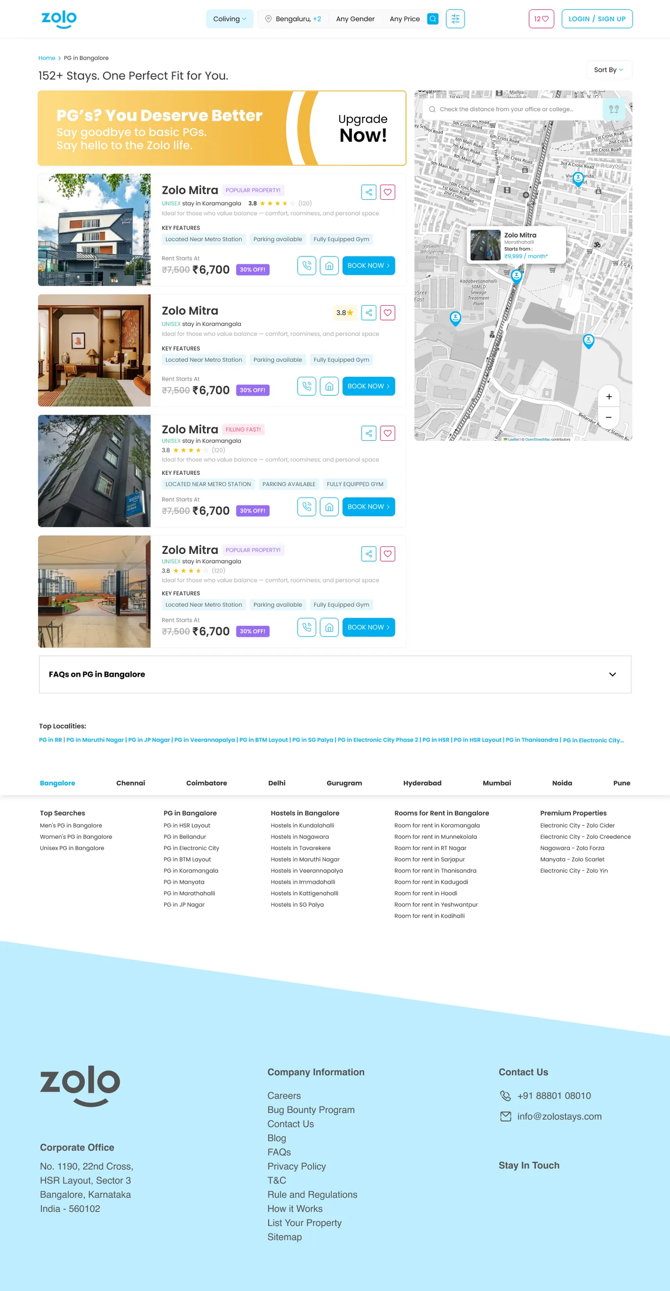
And what they saw was a grid of property cards that could have belonged to any aggregator in the country. We’d just spent the brand refresh clarifying what Zolostays stood for, and were showing none of it to the users who needed it most. So banners went into the results grid, carrying the positioning to people who arrived cold and breaking up long runs of near-identical cards. They were also the one content type available under the V1 rule — brand-level, written once, no per-property cost.
Then we looked at the data. Almost nobody was using the filters.
They sat in a horizontal bar across the top of the results — present, functional, and ignored. People were scrolling through unfiltered results instead of narrowing them, on the one page whose entire purpose is narrowing. My read: the top bar made filters feel like a step you’d already passed rather than a tool you could keep using. It scrolled away. It competed with the results and lost.
We moved them to a persistent left rail — always visible, adjustable while you look at results instead of before you see them. We also added tags for two new verticals, student living and daily stays.
Filter usage went from near-zero to routine, and click-through to properties rose with it. It’s the change I’m most confident about in V1, because I didn’t design it from a hypothesis. The analytics told me where to look.
Property Page
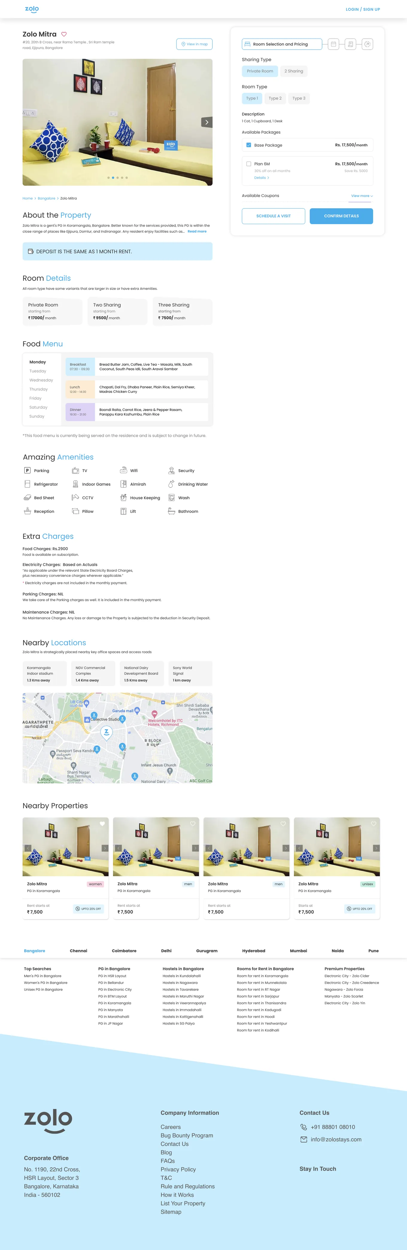
The most content-constrained page on the site, and the honest description is that V1 was a refresh.
We pushed the auto-generated description down the page, surfaced a three-column room comparison so the price range was visible without opening the booking widget, and broke out extra charges explicitly — food, electricity, parking, maintenance, including the ones that were nil. Hidden costs are the standard anxiety in Indian rental housing. Saying “parking: NIL” out loud is worth more than it looks.
What we couldn’t fix went on the list: room types labelled Type 1, Type 2, Type 3 with no price until after you’d picked one. Sixteen amenities in a flat icon list where CCTV carried the same weight as a pillow. No reviews. Nothing about community — the entire reason to choose managed co-living over a cheaper local PG.
Booking Flow
The worst experience on the site — cramped, hard to navigate, everything competing on a single screen. A new feature called Packages was landing, which forced the page open anyway.
We split it into five explicit steps: room selection, package selection, name and joining date, coupon selection, then confirmation and payment. Plus a step indicator, so you could see how much was left and what was coming. The old flow gave you no sense of progress. You were just in it until you weren’t.
The Impact
Bookings were seasonal and moved with property launches and pricing, so I won’t claim clean conversion attribution for the redesign. What changed and stayed changed:
- Filter usage went from near-zero to routine, with click-through to properties rising alongside it
- Booking completions went up and drop-offs fell once the flow had structure
- Homepage drop-off fell after the brand work
- The design system held — V2 piled a full restructure on top of it and never had to redo the visuals
V1 also did something less visible: it proved design work on this site returned value, which is what made the content investment arguable. The deferred list stopped being a wishlist and became a business case.
Version 2
With The Content We Needed
Key Insights
- People were now filtering well and reaching the right shortlist — then stalling, because the cards couldn’t separate two similar properties
- The property page was selling a room. The business sells co-living.
- Three verticals were sharing one homepage and one set of answers
- The four-step booking flow was navigable, and it had buried the price three steps deep
- Search existed because the homepage couldn’t route people itself
The Problem
V1 made the site legible. Legibility exposed how much of the structure was wrong — and every remaining fix needed the content we now had approval to build.
The Solution
Stop making people commit before they can see what it costs. That principle drove the two biggest changes, on two different pages.
Home — One Page Became Three
Co-living, student living, and daily stays were being served a single homepage that spoke to none of them properly. A student comparing hostels, a professional relocating for a year, and someone booking four nights are answering different questions on different timelines.
We split it into three tabbed experiences, each with its own positioning and entry into the funnel.
We also absorbed search directly into the homepage and deleted the search page. Search was a routing step that only existed because the homepage couldn’t route people itself. Once it could, the page had no reason to exist — one fewer step at the top of the funnel.
Listing — Cards That Decide
With property data available, we rebuilt the card around what people were actually comparing on, so a property could be ruled in or out from the results page instead of in a fifth open tab.
Property Page — Selling, Not Describing
This page changed more than any other.
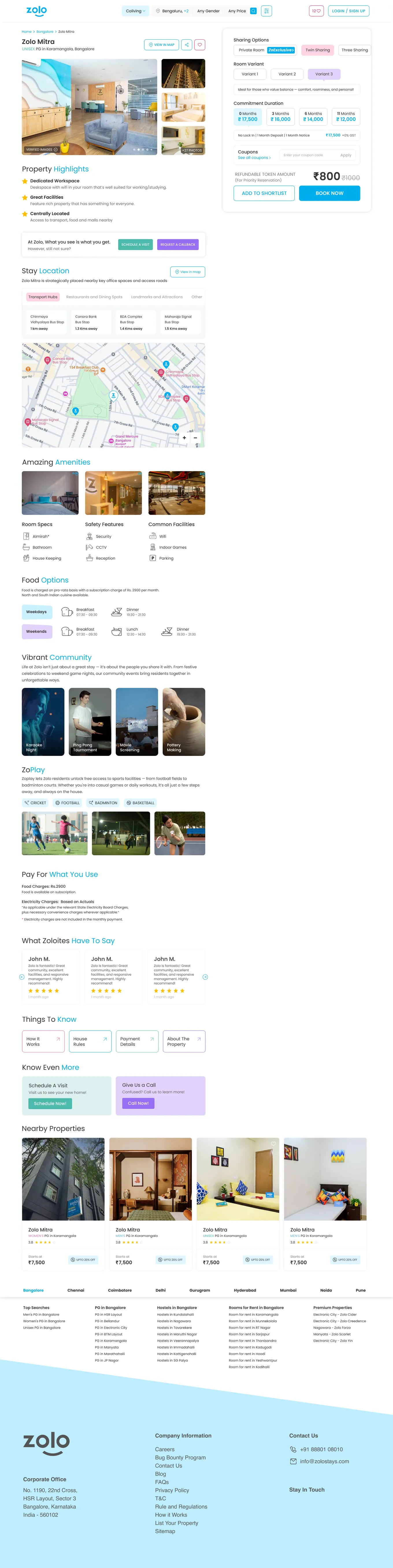
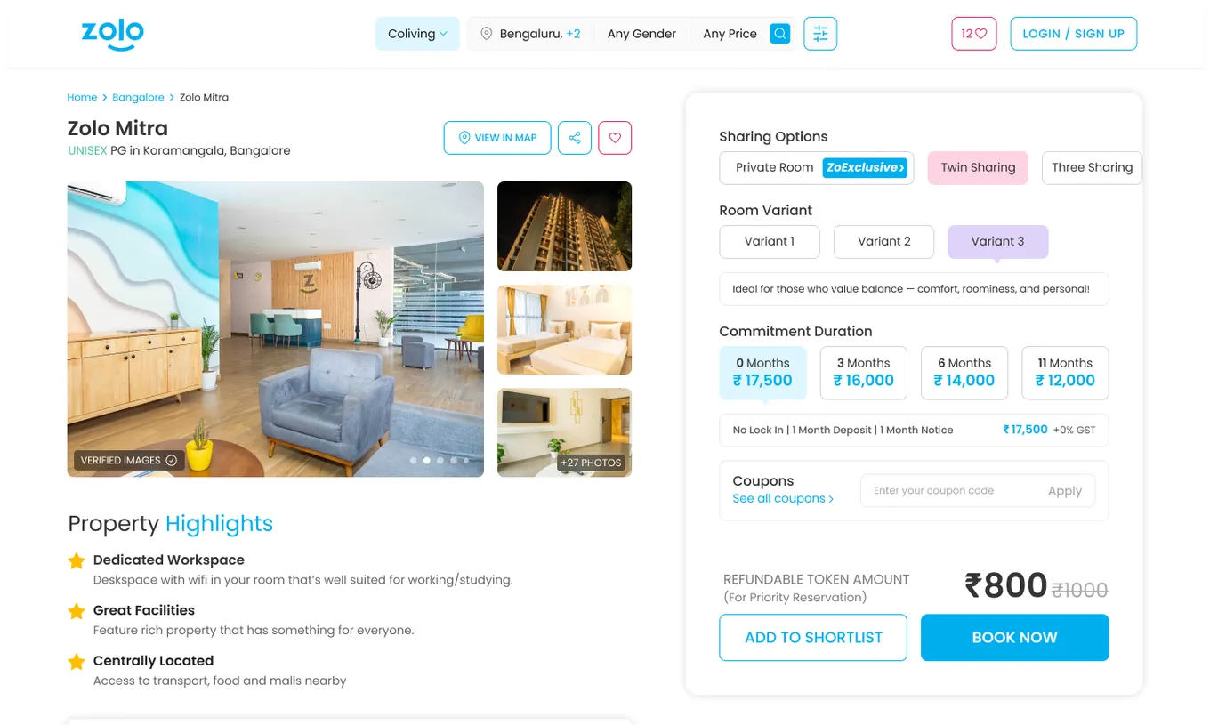
Price before commitment.V1 asked you to pick Type 1, Type 2, or Type 3 and showed the price after. V2 shows all three variants at once — ₹17,500, ₹16,000, ₹14,000 — each with a line about who it suits. Furniture inventory became a reason to choose. Deposit terms moved inline too, stated where the decision happens.
The top of the page went to the user. V1’s most valuable slot, directly under the gallery, held an auto-generated paragraph written for search engines. V2 gives it to three highlights you can scan in four seconds and moves the description into a “Things to Know” accordion at the bottom. The SEO content still exists and still ranks. It just stopped being the first thing a person reads.
Evidence replaced assertion.Verified images with a photo count, resident reviews, amenities grouped into room specs, safety, and common facilities — because safety is a category parents scan for and V1 had CCTV sitting next to “pillow.” Location split by transport, dining, and landmarks, because three different people are each checking a different one.
The product finally showed up. Community events and ZoPlay — free access to sports facilities — are the actual reason someone pays a premium over a local PG, and neither appeared on the old page at all. That wasn’t a UX fix. It was the page finally arguing the business’s differentiator.
Lower-commitment actions.V1 offered Schedule a Visit or Confirm Details. V2 adds a shortlist for people comparing several properties, and a ₹1,000 refundable token to hold a room — a smaller step than booking, and a way to hold intent that would otherwise decay.
The pivotal decision
Booking Flow — Undoing V1
We collapsed the flow back down.
V1 split booking into five steps and that was right for the problem V1 had. It also created a new one: room, package, and coupon were three separate screens, so the final price only appeared once you reached the coupon step. People made a sequence of choices without seeing what any of them cost, then met the number near the end. Navigable, and still anxious.
V2 puts room, package, and coupon on one page with the total updating live as you choose.
The two decisions look contradictory. They’re the same principle applied to different problems. V1’s flow failed because everything happened at once with no structure. V2’s failed because the structure separated a choice from its consequence. Both times the fix was to put what matters in front of the user at the moment they need it — which meant adding steps once and removing them the next time.
The Impact
- The funnel lost a step entirely when search was absorbed into the homepage
- Each vertical got an entry point that matched what its users were actually searching for
- Price became visible before commitment on both the property page and the booking flow
- The property page started arguing the differentiator instead of listing furniture
Both versions shipped over a period when Zolostays reached profitability. Occupancy, pricing, and portfolio decisions did the heavier lifting — but the website was where all that demand landed.